Exploring and Synthesizing Population Data
Generally it can be very useful to accurately model a single variable of a population.
Once you’ve measured a fit for your data you are able to derive and analyze new data with respect to a context, for example:
- Examine characteristics of single variables
- Take random samples representative of the entire dataset
- Determine if a new sample is representative of the existing data
We’ll be analyzing an example dataset to show how we can answer the questions above and show why answering these questions can be valuable.
For this we’ll be making use of the popular titanic dataset by loading it in through the seaborn sample data:
1import seaborn as sns
2import matplotlib.pyplot as plt
3
4titanic = sns.load_dataset('titanic')
And using seaborn to get a plot of the ages of people who were on the titanic:
1def plot_variable_histogram(series):
2    ax = sns.histplot(series, bins=30, kde=True, color='gray', line_kws={'linewidth': 2, 'color': 'red'})
3    ax.lines[0].set_color('crimson')
4    ax.plot()
5
6#get a histogram of population by age
7ages = titanic['age'].dropna()
8plot_variable_histogram(ages)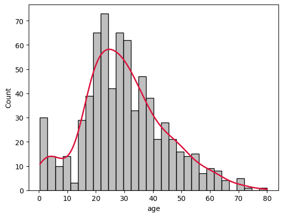
Here we’ve binned all the passengers into 30 groups and fitted a frequency curve with a KDE (Kernel Density Estimation) line that attempts to represent the histogram as a curve.
Kernel Density Estimation
This method adds together small distributions around each point to aggregate the probabilities, each point has a small gaussian curve that gets added with the gaussian curves of the points next to it to plot the final curve higher on the y axis.
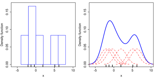
We can also plot the KDE independently of the histogram, and directly specify the type of kernel that we want for each point. We’ll choose gaussian just like in the default to see the results line up.
 1def chart_variable_density(series):
 2    kde = gaussian_kde(series)
 3    # Define a range for the KDE
 4    x_range = np.linspace(min(series) - 1, max(series) + 1, 1000)  # 1000 points across the data range
 5    # Compute KDE PDF values over the range
 6    pdf_values = kde(x_range)
 7    # Plot the KDE
 8    plt.plot(x_range, pdf_values, color='blue', lw=2)
 9    return x_range, pdf_values
10
11ages = titanic['age'].dropna()
12x_range, pdf_values = chart_variable_density(ages)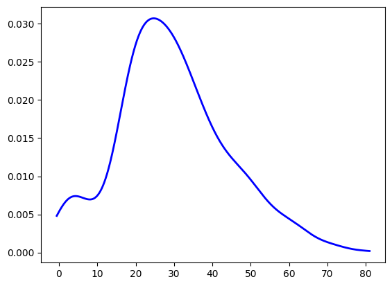
Sampling from a Distribution
Now we can use this distribution as the base for our random sampling!
Once we normalize the values of the KDE we can use it as the probability spectrum for np.random and get random samples subject to the same distribution as our data. In the example below we sampled 10,000 points to see how closely it resembles the KDE distribution.
 1def sample_based_on_kde(pdf_values, sample_size=10000):
 2    # Normalize PDF values to sum to 1
 3    pmf_values = pdf_values / pdf_values.sum()
 4
 5    # Sample points from the KDE distribution
 6    samples = np.random.choice(x_range, size=sample_size, p=pmf_values)
 7
 8    # Plot the original KDE
 9    fig, ax1 = plt.subplots(figsize=(10, 6))
10    ax2 = ax1.twinx()
11
12    data = pd.DataFrame({"age":x_range, "density":pdf_values/sum(pdf_values)})
13    sns.lineplot(ax=ax2,x="age", y="density", data=data, label="KDE PDF", color="blue")
14
15    # Plot histogram of samples
16    sns.histplot(samples, ax=ax1, bins=30, alpha=0.5, label="Sampled Points", color='orange')
17
18    plt.title("Sampling from KDE-Defined Distribution")
19    plt.xlabel("Value")
20    plt.ylabel("Density")
21    plt.legend()
22    plt.show()
23
24    return samples
25
26samples = sample_based_on_kde(pdf_values, sample_size = 10000)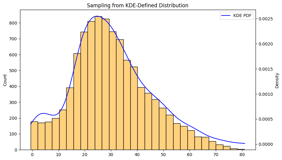
Here we see the histogram of the 10,000 samples and they match the KDE very closely.
Individual Samples
To see what this looks like on individual values we can chart this graph with just a handful of sample points. Imagine the red lines below are randomly selected people, but in fact they are new points, that were selected randomly based on the context our existing data gave us.
 1def draw_samples_on_histogram(series, x_range, pdf_values, samples):
 2    # Plot the KDE
 3    plt.figure(figsize=(10, 6))
 4    plt.plot(x_range, pdf_values, label="KDE PDF", color="blue")
 5
 6    # Plot histogram of the data for reference
 7    plt.hist(ages, bins=30, density=True, alpha=0.3, color="gray", label="Data Histogram")
 8
 9    # Plot vertical lines for each sampled point
10    kde = gaussian_kde(series)
11    plt.vlines(samples, ymin=0, ymax=kde(samples), color='red', alpha=0.6, linewidth=0.8, label="Sampled Points")
12
13    # Final plot labels and title
14    plt.title("Sampling from KDE-Defined Distribution with Sampled Points")
15    plt.xlabel("Value")
16    plt.ylabel("Density")
17    plt.legend()
18    plt.show()
19
20def sample_on_distribution(series, pdf_values, sample_size = 10):
21    # Normalize PDF values to sum to 1
22    pmf_values = pdf_values / pdf_values.sum()
23    x_range = np.linspace(min(series) - 1, max(series) + 1, 1000)  # 1000 points across the data range
24    samples = np.random.choice(x_range, size=sample_size, p=pmf_values)
25
26    draw_samples_on_histogram(series, x_range, pdf_values, samples)
27
28sample_on_distribution(ages, pdf_values, sample_size = 10)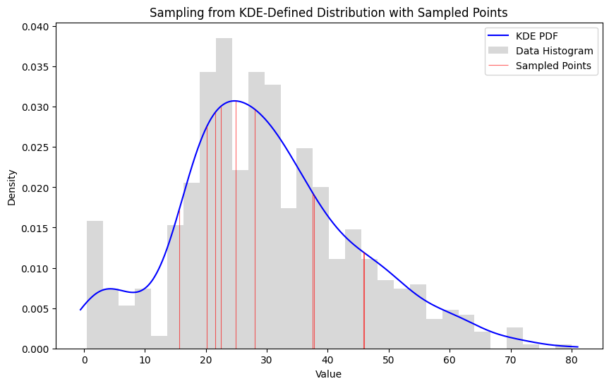
Points in the 20-30 age range are more likely to come up than ages in the 0-10 or 70-80 ranges. We can even say by how much by comparing the area under those segments of the curve.
1def subset_likelihood(series, subset):
2    # Fit a KDE to the data
3    kde = gaussian_kde(series)
4    # Compute the likelihood of each point in the subset
5    likelihoods = kde(subset)
6    # Compute the overall likelihood of the subset
7    subset_likelihood = likelihoods.prod()
8    log_likelihood = np.sum(np.log(likelihoods))
9    return subset_likelihood, log_likelihood
We can also multiply the probability of each point being chosen and compare the likelihood of various subsets. In this function we add together the log probabilities of a likely subset and compare it with an unlikely or random sample to establish the range for a sample of a fixed length.
Likely Subset
1#likely sample
2likely_sample = pd.Series([28, 32, 25, 30, 22])
3likelihood, log_likelihood = subset_likelihood(ages, likely_sample)
4print("Subset Likelihood:", likelihood)
5print("Log Likelihood:", log_likelihood)
6draw_samples_on_histogram(ages, x_range, pdf_values, likely_sample)
7
8Subset Likelihood: 2.0059300667485313e-08
9Log Likelihood: -17.72457291705993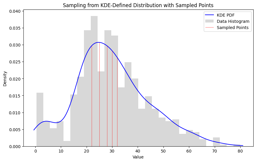
Unlikely Subset
1#unlikely sample
2unlikely_subset = pd.Series([28, 32, 25, 30, 22])
3likelihood, log_likelihood = subset_likelihood(ages, unlikely_subset)
4print("Subset Likelihood:", likelihood)
5print("Log Likelihood:", log_likelihood)
6draw_samples_on_histogram(ages, x_range, pdf_values, unlikely_subset)
7
8Subset Likelihood: 3.5243296326736624e-12
9Log Likelihood: -26.37133087287794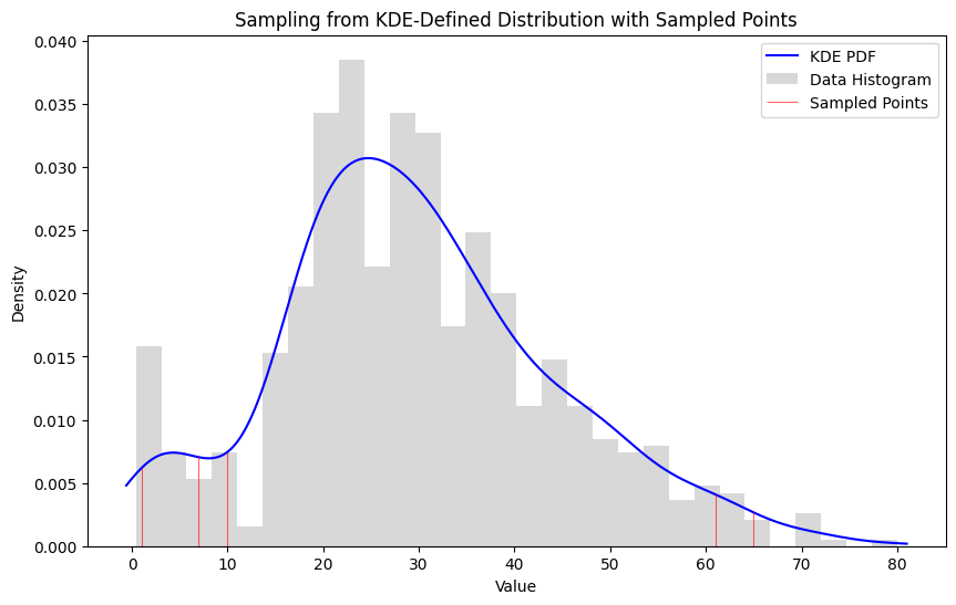
Random Subset
1#random sample
2random_sample = generate_samples(x_range, pdf_values, sample_size=5)
3likelihood, log_likelihood = subset_likelihood(ages, random_sample)
4print("Subset Likelihood:", likelihood)
5print("Log Likelihood:", log_likelihood)
6draw_samples_on_histogram(ages, x_range, pdf_values, random_sample)
7
8Subset Likelihood: 8.882741892157985e-10
9Log Likelihood: -20.84174064895712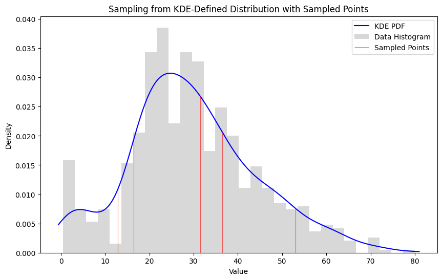
We can clearly see that a likely subset has a higher log likelihood than an unlikely subset with the range being somewhere between -17 and -27 log likelihood with a random sample falling somewhere in the middle. This is a quick and rough method of comparing subset likelihoods and there are other methods to arrive at this measure but the bottom line is that the KDE allows us to both create samples and compare samples of a dataset.